


 This year, with a couple of shows under my apron, I will be on the other side of the booth as a vendor, hoping to meet lots of cool folks, hug lots of new friends, and sell lots of my neat-o work! If any of you are in the area, please, please come and check it out. You will not leave empty handed. In addition to all the tempting goodies crafted and otherwise, there will be make & take demos, and I'm giving out free hugs! It's going to rock!
Monday, April 26, 2010
When you say, "Craftstravaganza," you've said it all!
Last year, I took in my first St. Paul Craftstravaganza as a shopper, in awe of the awesomeness at every single booth (yes! None disappointed!), and taking mental notes for what I might do were I to tackle my own craft fair booth someday.
 This year, with a couple of shows under my apron, I will be on the other side of the booth as a vendor, hoping to meet lots of cool folks, hug lots of new friends, and sell lots of my neat-o work! If any of you are in the area, please, please come and check it out. You will not leave empty handed. In addition to all the tempting goodies crafted and otherwise, there will be make & take demos, and I'm giving out free hugs! It's going to rock!
This year, with a couple of shows under my apron, I will be on the other side of the booth as a vendor, hoping to meet lots of cool folks, hug lots of new friends, and sell lots of my neat-o work! If any of you are in the area, please, please come and check it out. You will not leave empty handed. In addition to all the tempting goodies crafted and otherwise, there will be make & take demos, and I'm giving out free hugs! It's going to rock!

Thursday, April 1, 2010
Foot (well, half a foot) in the Door
Thanks to my local Twitter contacts and some artsy friends, I heard about "Foot in the Door 4" with enough time to create and submit a piece for the event. The exhibit is produced and managed by the Minnesota Artists Exhibition Program as a subset of the Minneapolis Institute of Art. You can read all about it on their Web site, but basically the once-a-decade exhibit displays any and all submissions so long as each one fits within one square foot. It took me a while to get the play on words.
The whole family joined me on the day I submitted my work and we had to wait in line for about twenty minutes before passing my piece, a 5 x 7 topography in teal, to the capable hands of a curator. While we were waiting in line, a man was interviewing other artists about their work and why they thought this might be their big break. He didn't interview me, but I'm in the background a few times in this video!
We returned a few weeks later after the exhibit had opened and searched among the thousands of pieces for my work. I was bit disappointed that we weren't all entitled a full square or cubic foot, but rather that we were bunched to fit as efficiently on the wall as possible. It would have been nice to make use of that white space, but truthfully, had the curators arranged the pieces that way, the exhibit would have eaten up an entire wing of the institute.
Here are a few photos of our visit.
Entering the second floor of the new wing and being welcomed by the overflowing art!

Finding the wall with my piece on it -- no easy task.

A closer look finds my work just above a photo of "Little Edie" Bouvier Beale at the Grey Gardens estate.

I was quite impressed with the caliber of talent and the variety of media used throughout the exhibit. Perhaps I expected more paint-by-number pieces or attempts at "anti-art" with pages torn from a notebook with the word "art" written on it. Instead, there were loads of fascinating, poignant, and downright beautiful works. I really should go back and take more time to take it all in.
Before leaving, my daughter requested I snap a photo of the gorgeous Chihuly piece hanging in the main lobby. She has affectionately dubbed it, the "flaming mac & cheese ball." It works for me.

The whole family joined me on the day I submitted my work and we had to wait in line for about twenty minutes before passing my piece, a 5 x 7 topography in teal, to the capable hands of a curator. While we were waiting in line, a man was interviewing other artists about their work and why they thought this might be their big break. He didn't interview me, but I'm in the background a few times in this video!
We returned a few weeks later after the exhibit had opened and searched among the thousands of pieces for my work. I was bit disappointed that we weren't all entitled a full square or cubic foot, but rather that we were bunched to fit as efficiently on the wall as possible. It would have been nice to make use of that white space, but truthfully, had the curators arranged the pieces that way, the exhibit would have eaten up an entire wing of the institute.
Here are a few photos of our visit.
Entering the second floor of the new wing and being welcomed by the overflowing art!

Finding the wall with my piece on it -- no easy task.

A closer look finds my work just above a photo of "Little Edie" Bouvier Beale at the Grey Gardens estate.

I was quite impressed with the caliber of talent and the variety of media used throughout the exhibit. Perhaps I expected more paint-by-number pieces or attempts at "anti-art" with pages torn from a notebook with the word "art" written on it. Instead, there were loads of fascinating, poignant, and downright beautiful works. I really should go back and take more time to take it all in.
Before leaving, my daughter requested I snap a photo of the gorgeous Chihuly piece hanging in the main lobby. She has affectionately dubbed it, the "flaming mac & cheese ball." It works for me.

Monday, March 15, 2010
Topography Card Sets @ MoMA Store Online!

If you live outside New York and want your own set of the custom-colored, 4-card set of these topography cards, you're in luck! They are now available online at the MoMA Store site.
And to answer your question before you ask it, no, I haven't wrapped my brain around the fact that the listing for my cards exist in the same sales category as the Tim Burton, Andy Warhol, or Frank Lloyd Wright notecards. That's just a bit bigger than this noodle can handle. ;)
Friday, March 12, 2010
Custom Pieces for Awesome People
The requests for custom pieces continue to roll in and have been my "bread and butter" lately. Each one is a new challenge that helps me to learn about places on the map as well as new techniques to render those places. Here's a look at some of the latest custom pieces I've created.

I was thrilled to recreate the lakes I lived nearly for nearly 9 years: Mendota, Monona, and Wingra in Madison, Wisconsin. The heart of the city of Madison, the state's capital, sits in the middle of the isthmus between these two sister lakes. Just before we moved back to Minnesota, Madison adopted the tag line "Madison: Lake, City, Lake." Clever, huh?


Two big trends have emerged in my latest batch of custom requests: islands & Canada! The close up above and the piece beside it is my version of the Lake of Bays in Ontario, not too far from where my hubby I honeymooned. What a gorgeous area!
Only an hour and half away lies the equally "Swiss-cheese" like body of water known as Lake Joseph


Man, do those prehistoric glaciers know how to tear it up, or what? :)
Taking the cake for "most timely" request is one of the Vancouver area. It was neat to work on this piece while the Olympics were taking place.

Not quite into Canada, but following a similar shape pattern is the lovely and historic Lake Champlain that sits between eastern New York and western Vermont.


This request came with a color set I haven't used in my own topographies but looks stunning none the less. Yes, you can order a topography to match your walls, or get close anyway.
I made another piece in this color set about a week prior and the colors were specifically chosen to pay homage to the vineyards on Martha's Vineyard:

I worked on my first couple of 8-layer custom requests. One for the very real and beautiful island of St. Thomas in the Virgin Islands:


And one for the very surreal and lovely Never Neverland from Peter Pan!


Another island I conquered is that of Mumbai, India. I had no idea it was an island as it's barely cut off from the mainland by a river. Per the patron's request, I didn't feature any of the nearby land to accent the specific island region, and I added a star next to her hometown.


Below is a piece representing Samish Island in northwestern Washington. This island used to be an actual island, but after dikes were erected the land bridge emerged turning the island into more of a peninsula. The buyer of this piece described the area's lush flora and fauna to me in her request and it made my lust to visit Washington even greater.

The most complicated custom piece I've created so far is the piece I made of the Savannah, Georgia delta area, as part of a three-piece, custom-color set. Once I wrapped my mind around the idea that I was cutting out islands rather than trying to cut out the inlets, the process somehow became easier. Well, a little bit. It was a labor of love and I'm quite pleased with how it turned out.

The other two pieces in the set were one of Chicago, seated at the southwestern corner of Lake Michigan, and Manhattan, with it's famed bridges connecting everyone to "where it's at." I'm not certain, but I think the Manhattan piece might be the first piece I've made where I've included bridges.


There's a three-way tie for my favorite custom pieces of the last two months. In no particular order the first one is this 12 x 12" piece of the chain of lakes near Fairmont in southern Minnesota.


Because I was taking in such a good chunk of land as my subject, the scale of the lakes was quite small and it was tricky moving the blade in such tight little curves. Overall, I really like the abstract look of it. It's the sort of piece that, when framed and on display, someone might say, "My, what a unique piece of art," whereupon the owner of this piece proudly exclaims,"It's a hand cut recreation of the chain of lakes near where I grew up." And to this the first person gasps excitedly and is left speechless at the wonder of it all. *cheese* ;) In short, I like it because, to me, it is both cool art and cool geography.
Second is this piece of Cape Neddick in southeastern Maine. This may be the first coastal-centered piece I've made and I really like the overall composition of this piece and the high contrast between the stark white on the left and the deep aqua on the right. And the cut of the ocean into the land is killer.


Finally, there's this piece. A piece made of custom colors chosen to represent striations of land as from erosion. I don't think I would have thought of this on my own, and the colors together seem to brighter and stronger than the sum of their parts. Yet another reason why I love making custom pieces.


As my work and techniques continue to evolve, I hope you'll see some of the details in these custom pieces in my non-custom work as well. I love my job!

I was thrilled to recreate the lakes I lived nearly for nearly 9 years: Mendota, Monona, and Wingra in Madison, Wisconsin. The heart of the city of Madison, the state's capital, sits in the middle of the isthmus between these two sister lakes. Just before we moved back to Minnesota, Madison adopted the tag line "Madison: Lake, City, Lake." Clever, huh?


Two big trends have emerged in my latest batch of custom requests: islands & Canada! The close up above and the piece beside it is my version of the Lake of Bays in Ontario, not too far from where my hubby I honeymooned. What a gorgeous area!
Only an hour and half away lies the equally "Swiss-cheese" like body of water known as Lake Joseph


Man, do those prehistoric glaciers know how to tear it up, or what? :)
Taking the cake for "most timely" request is one of the Vancouver area. It was neat to work on this piece while the Olympics were taking place.

Not quite into Canada, but following a similar shape pattern is the lovely and historic Lake Champlain that sits between eastern New York and western Vermont.


This request came with a color set I haven't used in my own topographies but looks stunning none the less. Yes, you can order a topography to match your walls, or get close anyway.
I made another piece in this color set about a week prior and the colors were specifically chosen to pay homage to the vineyards on Martha's Vineyard:

I worked on my first couple of 8-layer custom requests. One for the very real and beautiful island of St. Thomas in the Virgin Islands:


And one for the very surreal and lovely Never Neverland from Peter Pan!


Another island I conquered is that of Mumbai, India. I had no idea it was an island as it's barely cut off from the mainland by a river. Per the patron's request, I didn't feature any of the nearby land to accent the specific island region, and I added a star next to her hometown.


Below is a piece representing Samish Island in northwestern Washington. This island used to be an actual island, but after dikes were erected the land bridge emerged turning the island into more of a peninsula. The buyer of this piece described the area's lush flora and fauna to me in her request and it made my lust to visit Washington even greater.

The most complicated custom piece I've created so far is the piece I made of the Savannah, Georgia delta area, as part of a three-piece, custom-color set. Once I wrapped my mind around the idea that I was cutting out islands rather than trying to cut out the inlets, the process somehow became easier. Well, a little bit. It was a labor of love and I'm quite pleased with how it turned out.

The other two pieces in the set were one of Chicago, seated at the southwestern corner of Lake Michigan, and Manhattan, with it's famed bridges connecting everyone to "where it's at." I'm not certain, but I think the Manhattan piece might be the first piece I've made where I've included bridges.


There's a three-way tie for my favorite custom pieces of the last two months. In no particular order the first one is this 12 x 12" piece of the chain of lakes near Fairmont in southern Minnesota.


Because I was taking in such a good chunk of land as my subject, the scale of the lakes was quite small and it was tricky moving the blade in such tight little curves. Overall, I really like the abstract look of it. It's the sort of piece that, when framed and on display, someone might say, "My, what a unique piece of art," whereupon the owner of this piece proudly exclaims,"It's a hand cut recreation of the chain of lakes near where I grew up." And to this the first person gasps excitedly and is left speechless at the wonder of it all. *cheese* ;) In short, I like it because, to me, it is both cool art and cool geography.
Second is this piece of Cape Neddick in southeastern Maine. This may be the first coastal-centered piece I've made and I really like the overall composition of this piece and the high contrast between the stark white on the left and the deep aqua on the right. And the cut of the ocean into the land is killer.


Finally, there's this piece. A piece made of custom colors chosen to represent striations of land as from erosion. I don't think I would have thought of this on my own, and the colors together seem to brighter and stronger than the sum of their parts. Yet another reason why I love making custom pieces.


As my work and techniques continue to evolve, I hope you'll see some of the details in these custom pieces in my non-custom work as well. I love my job!
Monday, March 8, 2010
The Big Melt
Our massive piles of snow are retreating and there are buds on all the twiggy things. Despite the fact that the temps stay above freezing even overnight these days, I am still hesitant to break out the shorts and sandals and welcome Spring.
This is Minnesota. Here, it can snow in July and freeze in August. Spring is often more a battle between Winter and Summer than a slow and forward progression from cold to warm. Still, in honor of the changes we've seen in these glorious last two weeks, here is my latest treasury featuring stunning pieces from members of the HandmadeMN team. Enjoy the little bits of color!
Winter's End

row 1: SteampunkVintage, AdornJewelry, cholulajewelry, ALineofHerOwn
row 2: westernartglass, ShaggyBaggy, laurabrownart, athenaslittleowl
row 3: JennyBunny, TCWitchcraftFactory, FennelStudio, fromoutofthecracks
row 4: glorioushats, byrdandbelle, connectedelements, XOHandworks
This is Minnesota. Here, it can snow in July and freeze in August. Spring is often more a battle between Winter and Summer than a slow and forward progression from cold to warm. Still, in honor of the changes we've seen in these glorious last two weeks, here is my latest treasury featuring stunning pieces from members of the HandmadeMN team. Enjoy the little bits of color!
Winter's End

row 1: SteampunkVintage, AdornJewelry, cholulajewelry, ALineofHerOwn
row 2: westernartglass, ShaggyBaggy, laurabrownart, athenaslittleowl
row 3: JennyBunny, TCWitchcraftFactory, FennelStudio, fromoutofthecracks
row 4: glorioushats, byrdandbelle, connectedelements, XOHandworks
Friday, January 22, 2010
This Mama's at the MoMA!
I cannot contain my super top secret any longer!
To set the scene:
Imagine me, leaping around the house, pigtails flying, singing "tra-la-laaaaa" a la Captain Underpants, bumping into doorways, with small children and a giant dog excitedly chasing after me.
Got it?
That's how thrilled I am .
Crafterall has landed at the Museum of Modern Art retail store in New York!
Currently, they're selling these lovely "Layered Love" cards in time for the mushy stuff to come next month.

Coming in February, these custom colored topography card sets in Sea Foam, Royal, Poppy and Violet.

It's been rough keeping this news under wraps until I knew the cards were physically in the store. I had told a few people after I was first contacted by a MoMA rep, but I made them swear to secrecy and threatened them with dollar store greeting cards for the rest of all their birthdays if they leaked the news.
While I was prepared to undertake the size of the order, I did climb a pretty steep learning curve related to the paperwork and shipping procedures necessary to conduct business with a bigger retail outlet. For instance, I now know what a bill of lading is and have created my own version of one to use again, as well as my own custom packing slip and invoice. I feel so... official.
So, many of you are probably wondering how this all happened. I suppose I can say that great product photos, original designs, and a swing toward to the modern side of styles was all it took, but I think luck played a very nice hand in this instance.
Back in late August, I was contacted via Etsy by a Paper Products Manager for MoMA Retail who was browsing the stationary on the site and was drawn to my topography cards. Luck. She requested some samples, I sent her a few topography cards in a variety of colors as well as a couple of other cards I was making at the time.
Around that time, I was transitioning from a discontinued line of cardstock to a newer one with more color options (luck), so a few weeks later, I sent more samples and a color swatch sheet for reference. The rep conferred with her people and got back to my people (well, just me, really), with four color choices for a custom set, and also mentioned interest in buying the heart cards for Valentine's day. Luck. She was also able to give me a heads up on the item count before the actual purchase order giving me ample time to complete everything. She has been a dream to work with since our very first correspondence and continues to cheerfully lead me through the big business processes. Major Luck.
So that's that! I've googled "Etsy" and "MoMA" together a bunch of times and have not yet read anything from anybody else like me who's been hand plucked like this. Has this or something like it happened to anyone else out there? I feel very strange, honored, and I'll say it again, LUCKY to be where I am.
And I'm happy as can be.
Perhaps it's a bit of a stretch, but it sort of feels like I've won a big award. So, in that light, I'll close this post with my acceptance speech full of thanks and dedications:
Thank you so much! Seriously, thank YOU! Yes YOU, reading this blog post right now. Because I know you care enough to come to my blog and read through this, I grow more confident and continue to create pieces that may catch the eyes of highfalutin retail shop managers. Thanks, too, to my friends and family who offer good criticism and support of what I do. Specifically, I thank my dear friend Kendra Zvonik who has held my hand through this whole process, who pulls my feet back down to earth when I float away in uncertainty, and who lifts me up when I wallow in frustration. I dedicate these happy vibes to my patient and supportive hubby and to my two crafty girls who've quietly watched me cut paper in my studio when they would have rather been playing hide and seek or wild cat rescue.
It feels so great to let this kitty out of the bag. Let's hope it enjoys a wild adventure out there!
To set the scene:
Imagine me, leaping around the house, pigtails flying, singing "tra-la-laaaaa" a la Captain Underpants, bumping into doorways, with small children and a giant dog excitedly chasing after me.
Got it?
That's how thrilled I am .
Crafterall has landed at the Museum of Modern Art retail store in New York!
Currently, they're selling these lovely "Layered Love" cards in time for the mushy stuff to come next month.

Coming in February, these custom colored topography card sets in Sea Foam, Royal, Poppy and Violet.

It's been rough keeping this news under wraps until I knew the cards were physically in the store. I had told a few people after I was first contacted by a MoMA rep, but I made them swear to secrecy and threatened them with dollar store greeting cards for the rest of all their birthdays if they leaked the news.
While I was prepared to undertake the size of the order, I did climb a pretty steep learning curve related to the paperwork and shipping procedures necessary to conduct business with a bigger retail outlet. For instance, I now know what a bill of lading is and have created my own version of one to use again, as well as my own custom packing slip and invoice. I feel so... official.
So, many of you are probably wondering how this all happened. I suppose I can say that great product photos, original designs, and a swing toward to the modern side of styles was all it took, but I think luck played a very nice hand in this instance.
Back in late August, I was contacted via Etsy by a Paper Products Manager for MoMA Retail who was browsing the stationary on the site and was drawn to my topography cards. Luck. She requested some samples, I sent her a few topography cards in a variety of colors as well as a couple of other cards I was making at the time.
Around that time, I was transitioning from a discontinued line of cardstock to a newer one with more color options (luck), so a few weeks later, I sent more samples and a color swatch sheet for reference. The rep conferred with her people and got back to my people (well, just me, really), with four color choices for a custom set, and also mentioned interest in buying the heart cards for Valentine's day. Luck. She was also able to give me a heads up on the item count before the actual purchase order giving me ample time to complete everything. She has been a dream to work with since our very first correspondence and continues to cheerfully lead me through the big business processes. Major Luck.
So that's that! I've googled "Etsy" and "MoMA" together a bunch of times and have not yet read anything from anybody else like me who's been hand plucked like this. Has this or something like it happened to anyone else out there? I feel very strange, honored, and I'll say it again, LUCKY to be where I am.
And I'm happy as can be.
Perhaps it's a bit of a stretch, but it sort of feels like I've won a big award. So, in that light, I'll close this post with my acceptance speech full of thanks and dedications:
Thank you so much! Seriously, thank YOU! Yes YOU, reading this blog post right now. Because I know you care enough to come to my blog and read through this, I grow more confident and continue to create pieces that may catch the eyes of highfalutin retail shop managers. Thanks, too, to my friends and family who offer good criticism and support of what I do. Specifically, I thank my dear friend Kendra Zvonik who has held my hand through this whole process, who pulls my feet back down to earth when I float away in uncertainty, and who lifts me up when I wallow in frustration. I dedicate these happy vibes to my patient and supportive hubby and to my two crafty girls who've quietly watched me cut paper in my studio when they would have rather been playing hide and seek or wild cat rescue.
It feels so great to let this kitty out of the bag. Let's hope it enjoys a wild adventure out there!
Wednesday, January 20, 2010
What's New? I'll Show Ya!
Coming up for air here, after completing more than a handful of fun wholesale orders, fulfilling some awesome custom requests, and working on some NEW things for the shop. Imagine me, resurfacing form my basement studio, gasping for a breath, and with a huge, cheeky smile on my face. Life is good! This is a meaty post with lost of photos, so grab a beverage, find a comfy spot to sit, and read on!
First, a look at some custom pieces from the past two weeks. This is a "reverse" layered piece I cut of the Bahamas:

I started by cutting the white of the islands, layered those tiny pieces over the lightest shade of aqua, cut again, layered again, and so forth. As with most of my custom orders, I consider the region quite a bit while I'm working on it, and with this one, I enjoyed convincing myself that I was warmed by the equatorial sun as I carved out these island oases. It was well worth the time!

Then, I had a cool request for the Great Lakes.

While I disliked having to simplify some of the outlines for the sake of space, I thoroughly enjoyed creating the familiar silhouette of these massive bodies of water as well as learning about the bathymetry that lies beneath the surfaces of each lake. Who knew Lake Erie was so relatively flat, and that Lake Superior was spooky deep? (Well, probably loads of science and geology folks know that, but I learned something!)

One of the things I like best about working on custom orders is that they push me to try new things. Case in point, a custom order for Kim, a lovely mom and apple orchard owner. (Plug: She also has her own Etsy shop too!) She wants to start a gallery of apple-related art in a store on the orchard property, and she asked me if I could make a layered papercut with an apple as the subject. I could, and I did!

It was fun to use a variety of bold colors and to layer the paper differently than I usually do. I think it turned out well and I'm tempted to make more like this. Thanks, Kim!

Lastly, I worked my fingers to the bone finishing fifty of these little beauties for a delightful shop owner in Chicago. They are blank cards featuring a layered papercut of Lake Michigan with a little star representing the Windy City. Aren't they cool?

After a while, the shape of Lake Michigan began to resemble a strange, large-abdomen-ed insect, but filling in the shape with the depth layers helped dispel that idea. ;) Silly me.
New in the shop this month, the "Layered Love" cards are back for Valentine's Day and they're better than ever. Brighter colors, bigger hearts, and your choice of Poppy Reds:

Or Pinky Pinks:

I also introduced the new Teal colorway into the Topography piece collection:

It's lighter and bluer than the aqua scheme, and I really like it. As you can see in the piece above, I'm working more islands into my pieces as well. It takes more time to do this, but I believe the result is totally worth it.

Finally, I worked through a sketch I've had in my head for a long time and came out with these fun, new card sets. I call them "Googie cards" after the mid-century Googie architecture movement with all its funky geometry and groovy color palettes. Mine come in sets of two cards with one card layered dark to light and the other card layered light to dark. Far out, huh?
They're available in Sea Foam (where did I put that leisure suit?):

Harvest Gold (just like Grandma's oven!):

and Avocado, baby (reminiscent of that delicious shag carpeting you tore out of your old house):

It was nice to take a little break from non-stop topography and it has always been fun experimenting with new ideas. Man, I love what I do!
First, a look at some custom pieces from the past two weeks. This is a "reverse" layered piece I cut of the Bahamas:
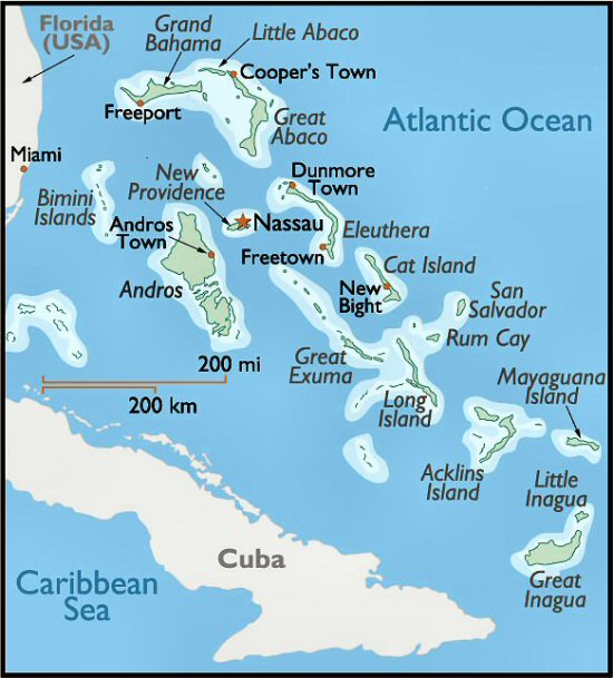

I started by cutting the white of the islands, layered those tiny pieces over the lightest shade of aqua, cut again, layered again, and so forth. As with most of my custom orders, I consider the region quite a bit while I'm working on it, and with this one, I enjoyed convincing myself that I was warmed by the equatorial sun as I carved out these island oases. It was well worth the time!

Then, I had a cool request for the Great Lakes.


While I disliked having to simplify some of the outlines for the sake of space, I thoroughly enjoyed creating the familiar silhouette of these massive bodies of water as well as learning about the bathymetry that lies beneath the surfaces of each lake. Who knew Lake Erie was so relatively flat, and that Lake Superior was spooky deep? (Well, probably loads of science and geology folks know that, but I learned something!)

One of the things I like best about working on custom orders is that they push me to try new things. Case in point, a custom order for Kim, a lovely mom and apple orchard owner. (Plug: She also has her own Etsy shop too!) She wants to start a gallery of apple-related art in a store on the orchard property, and she asked me if I could make a layered papercut with an apple as the subject. I could, and I did!

It was fun to use a variety of bold colors and to layer the paper differently than I usually do. I think it turned out well and I'm tempted to make more like this. Thanks, Kim!

Lastly, I worked my fingers to the bone finishing fifty of these little beauties for a delightful shop owner in Chicago. They are blank cards featuring a layered papercut of Lake Michigan with a little star representing the Windy City. Aren't they cool?

After a while, the shape of Lake Michigan began to resemble a strange, large-abdomen-ed insect, but filling in the shape with the depth layers helped dispel that idea. ;) Silly me.
New in the shop this month, the "Layered Love" cards are back for Valentine's Day and they're better than ever. Brighter colors, bigger hearts, and your choice of Poppy Reds:

Or Pinky Pinks:

I also introduced the new Teal colorway into the Topography piece collection:

It's lighter and bluer than the aqua scheme, and I really like it. As you can see in the piece above, I'm working more islands into my pieces as well. It takes more time to do this, but I believe the result is totally worth it.

Finally, I worked through a sketch I've had in my head for a long time and came out with these fun, new card sets. I call them "Googie cards" after the mid-century Googie architecture movement with all its funky geometry and groovy color palettes. Mine come in sets of two cards with one card layered dark to light and the other card layered light to dark. Far out, huh?
They're available in Sea Foam (where did I put that leisure suit?):

Harvest Gold (just like Grandma's oven!):

and Avocado, baby (reminiscent of that delicious shag carpeting you tore out of your old house):

It was nice to take a little break from non-stop topography and it has always been fun experimenting with new ideas. Man, I love what I do!
Subscribe to:
Posts (Atom)